LONG & FOSTER
DESIGN TOOLS
TASK:
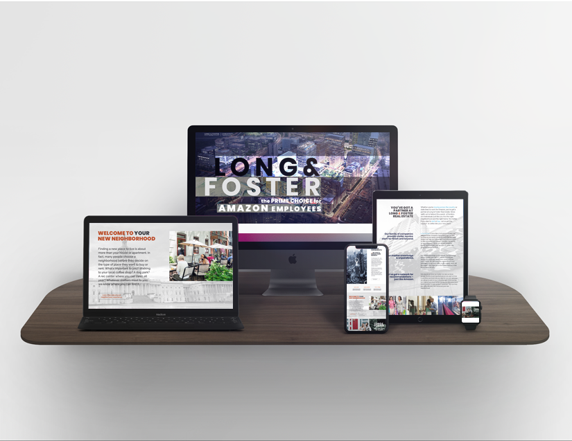
Design a vibrant, clean web page that celebrates Amazon’s new headquarters and whose fresh look and feel is a departure from Long & Foster’s (L&F) current website.
ACTION:
Created a design strategy that borrows design cues from Long & Foster website while adding cool new design features to the web page.
RESULT:
A fresh website that feels new and creates excitement around Amazon’s new headquarters.
Long & Foster Real Estate is the United States’ largest privately owned real estate company. It is among the top 20 largest private companies in the world. Long & Foster has more than 11,000 agents in over 220 sales offices in the Mid-Atlantic and Northeast regions.
After a year of deliberation, Amazon finally chose Crystal City, VA as the location of its second headquarters. Long and Foster wanted a website to be designed to create a buzz around Amazon’s new headquarters in an effort to advertise Long and Foster’s local real estate expertise.
Long and Foster told me directly, that they didn’t want a new web landing page that simply mimicked their corporate website. My web landing page design should add funk, fresh, and fun elements to the design in keeping with the excitement that is Amazon’s new headquarters. Long and Foster loved the design I created for their web landing page.
EMPLOYER:
Canon Medical, Inc.
CATEGORY:
UI/UX Design


